The financial crisis was hell for pretty much everybody, rich or
poor. But the recovery that has followed has not been nearly as fair.
Wall Street, the wealthy and the powerful have done amazingly well since the crisis ended. Little of that has trickled down to everybody else, in what has been the most uneven recovery in at least several decades.
How about some charts to illustrate this infuriating result?
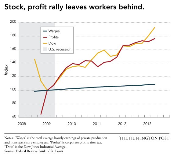
1. The first sad chart might tell most of the story. It tracks the growth in corporate profits, the Dow Jones Industrial Average and average hourly wages of the typical worker since the crisis. To quote Sesame Street, one of these things is not like the others, one of these things just doesn't belong. (Hint: It is your pitiful wages.)
2. It is not particularly shocking that corporate profits and stock-price gains have mostly benefited the wealthiest Americans. But this recovery appears to be less fair than other recoveries going back to the Depression, judging by data from UC Berkeley economist Emmanuel Saez. Here is a chart, with some faces, to show how the latest recovery stacks up against other recent ones:
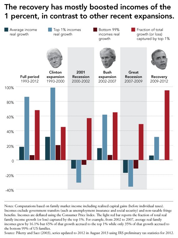
3. Saez points out that the wealthiest Americans' share of U.S. income is higher than at any point since before the Great Depression. Unlike the Depression, though, this recovery has not brought in new policies aimed at equality. If anything, we are getting right back to the pre-crisis business of letting the rich get richer and the poor get poorer.
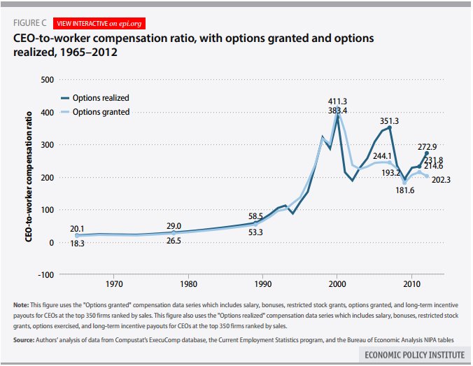
For example, CEO pay snapped back sharply after the crisis, with corporate leaders now back to making more than 200 times their employees, as seen in this chart from the Economic Policy Institute, a left-leaning think tank:
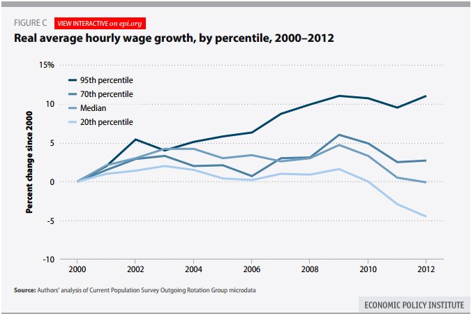
4. And the pay of the highest earners has far outpaced the rest of us, as seen in another EPI chart:
5. What about the banks that caused the crisis? Don't worry about them: Their profits are back to record highs:

6. In fact, the biggest banks are even bigger than before the crisis:

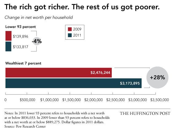
7. Soaring stocks and profits have widened the gap between the haves and the have-nots, according to data from the Pew Research Center:
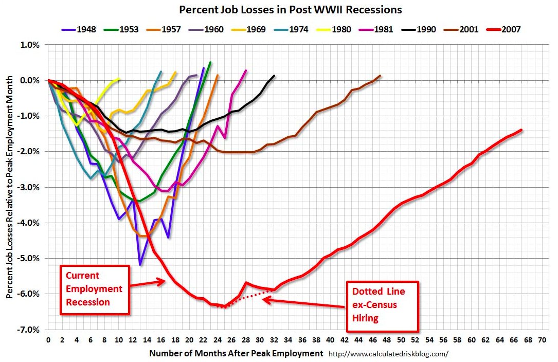
8. It might help if the labor market were better, but this has been the slowest job recovery since World War II, as seen in this famous chart updated every month by the Calculated Risk blog:
9. And most of the jobs created have been low-paying, according to the National Employment Law Project:

10. In fact, the low-paying sectors of food service, retail and temporary help have accounted for more than 40 percent of all the job growth, according to the NELP:

11. The recovery has also been uneven geographically, with only 13 states so far seeing unemployment get back to pre-recession levels:

12. And of course, predictably, the racial divide has been stark:

Original Article
Source: huffingtonpost.com
Author: Mark Gongloff, Jan Diehm, Katy Hall
Wall Street, the wealthy and the powerful have done amazingly well since the crisis ended. Little of that has trickled down to everybody else, in what has been the most uneven recovery in at least several decades.
How about some charts to illustrate this infuriating result?
1. The first sad chart might tell most of the story. It tracks the growth in corporate profits, the Dow Jones Industrial Average and average hourly wages of the typical worker since the crisis. To quote Sesame Street, one of these things is not like the others, one of these things just doesn't belong. (Hint: It is your pitiful wages.)
2. It is not particularly shocking that corporate profits and stock-price gains have mostly benefited the wealthiest Americans. But this recovery appears to be less fair than other recoveries going back to the Depression, judging by data from UC Berkeley economist Emmanuel Saez. Here is a chart, with some faces, to show how the latest recovery stacks up against other recent ones:
3. Saez points out that the wealthiest Americans' share of U.S. income is higher than at any point since before the Great Depression. Unlike the Depression, though, this recovery has not brought in new policies aimed at equality. If anything, we are getting right back to the pre-crisis business of letting the rich get richer and the poor get poorer.
For example, CEO pay snapped back sharply after the crisis, with corporate leaders now back to making more than 200 times their employees, as seen in this chart from the Economic Policy Institute, a left-leaning think tank:
4. And the pay of the highest earners has far outpaced the rest of us, as seen in another EPI chart:
5. What about the banks that caused the crisis? Don't worry about them: Their profits are back to record highs:
6. In fact, the biggest banks are even bigger than before the crisis:
7. Soaring stocks and profits have widened the gap between the haves and the have-nots, according to data from the Pew Research Center:
8. It might help if the labor market were better, but this has been the slowest job recovery since World War II, as seen in this famous chart updated every month by the Calculated Risk blog:
9. And most of the jobs created have been low-paying, according to the National Employment Law Project:
10. In fact, the low-paying sectors of food service, retail and temporary help have accounted for more than 40 percent of all the job growth, according to the NELP:
11. The recovery has also been uneven geographically, with only 13 states so far seeing unemployment get back to pre-recession levels:
12. And of course, predictably, the racial divide has been stark:
Original Article
Source: huffingtonpost.com
Author: Mark Gongloff, Jan Diehm, Katy Hall
No comments:
Post a Comment